
























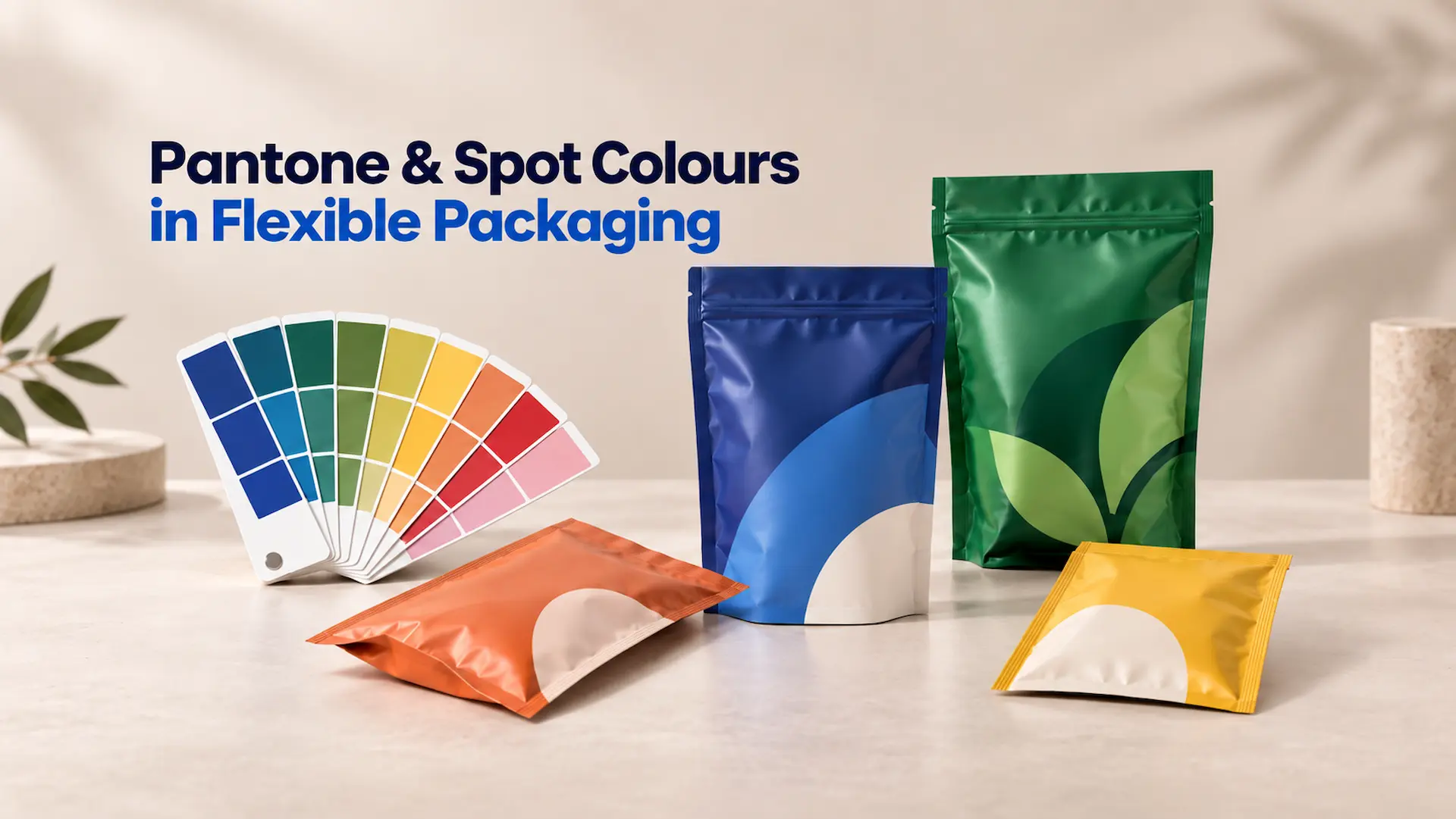
Getting a brand colour right on packaging sounds simple until the design leaves the screen and reaches the printing press. A deep red, bright orange, or signature blue may look perfect in a design file but change once ink meets film. That is why colour planning matters when producing custom printed pouches for products that need a consistent and recognisable look. The print method, pouch material, white ink, and finish can all influence what customers finally see on the shelf.
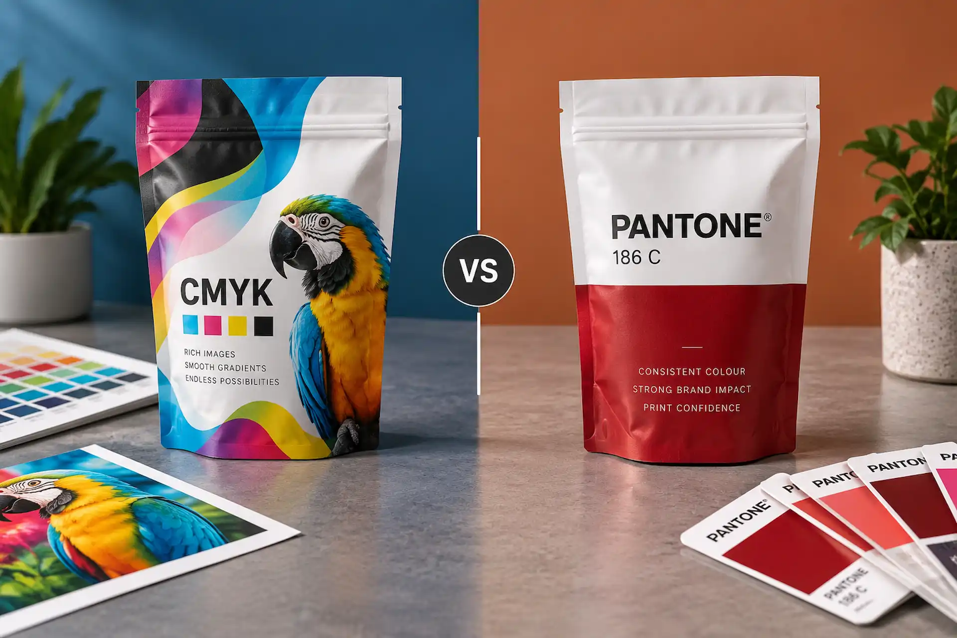
Pantone spot colours give brands a clear colour reference, while CMYK provides a practical way to print photographs, gradients, and complex artwork. Neither system is automatically better for every job. Good results come from knowing where each one works best and setting realistic expectations before production starts. This guide explains the Pantone Matching System, CMYK vs Pantone, spot colour vs process colour, and the steps that help improve brand colour matching on flexible packaging.
What Are Pantone Spot Colours?
Before comparing printing methods, it helps to be clear on what a spot colour actually is and what the Pantone system does with it.
What Is a Spot Colour?
A spot colour is a single, ready-mixed ink. It is made to a formula before it reaches the press and prints as one solid colour from one printing unit.
Think of paint mixed at a hardware store. The formula is written down, and what goes on the wall is already the finished shade. Process printing works the other way around, laying tiny dots of four inks and letting your eye do the mixing.
What Is the Pantone Matching System (PMS)?
The Pantone Matching System, usually shortened to PMS, is the shared language that makes spot colours work across companies and countries.
Every colour carries a number pointing to a specific ink recipe. Write “Pantone 186 C” on a specification and a designer, a prepress team and a press operator in three different places are all looking at the same target. Without that number, colour turns into description, and “our red” means nothing on a press floor.
A few things worth knowing about the codes:
- The number identifies the ink formula.
- The letter suffix tells you the reference surface. C is coated, U is uncoated, M is matte coated.
- The same number can look different across suffixes, because the surface under the ink changes what your eye receives.
Why Pantone Colours Are Important for Brand Packaging
Colour is the first thing a shopper registers, and the element most likely to drift between orders. Pantone spot colours earn their place when:
- Your logo has a signature colour. People recognise the colour before the name.
- Large solid blocks dominate the design. Flat areas show variation far more than photographs.
- You reorder regularly. A fixed reference stops slow drift across print runs.
- You run several SKUs. Flavour and variant colours need to stay distinct.
- Your packaging sits beside competitors on the shelf. Consistency reads as quality.
Spot Colour vs Process Colour: What Is the Difference?
These two terms get used loosely, but they describe genuinely different ways of putting colour onto a pouch.
How Spot Colour Printing Works
Spot colour printing gives one colour its own place on the press. The ink is formulated to match a Pantone reference, it gets its own printing station, and it prints as a solid rather than a pattern of dots.
Because the colour is not assembled on press, fewer variables can push it off target. That is why spot inks suit brand-critical work: a logo, a signature background, a colour strip running across a whole product range.
How CMYK Process Colour Works
CMYK stands for Cyan, Magenta, Yellow and Key (black). The press lays down small dots of each ink, and from normal viewing distance your eye blends them into a continuous image. Four inks cover an enormous range in one pass, which makes process printing the natural fit for:
- Product photography
- Gradients and soft shadows
- Detailed illustrations
- Designs carrying many colours at once
The trade-off is that every colour is constructed rather than delivered, and more construction means more variables.
Can Spot Colours and CMYK Be Used Together?
Yes, and on packaging it is extremely common. A coffee bag might carry a photograph of beans, body copy, an ingredients panel and a logo that has to be exact. Those elements do not need the same treatment.
| Artwork element | Usually handled by |
| Product photography | CMYK process |
| Background gradients | CMYK process |
| Body copy and legal text | Black (100K) |
| Logo and signature brand colour | Pantone spot colour |
| Large flat colour panels | Pantone spot colour |
| Clear windows or metallic areas | White ink strategy |
CMYK vs Pantone: Which Is Better for Flexible Packaging?
Neither wins outright. The right answer depends on your artwork, print process, quantity and how strict your brand colour actually is.
| Requirement | CMYK | Pantone Spot Colour |
| Photographs | Excellent choice | Not normally used alone |
| Gradients | Very suitable | Less practical |
| Complex multi-colour artwork | Efficient | May require extra colours |
| Critical solid brand colour | Depends on available gamut | Strong option when supported |
| Digital pouch printing | Standard approach | Usually simulated/conversion required |
| Rotogravure printing | Common | Dedicated spot colours can be used |
| Large product images | Excellent | Not its main purpose |
| Repeat solid brand shades | Good with process control | Strong colour reference |
Choose CMYK for Photos, Gradients and Multi-Colour Graphics
If your pouch leads with imagery, CMYK is doing the heavy lifting whether you plan for it or not. Short runs and frequent design changes point the same way, since there is no tooling to pay for or wait on.
Choose Pantone for Brand-Critical Solid Colours
Pantone earns its keep when a colour is doing brand work: a logo, a signature panel, or a shade customers associate with you directly. It also helps with colours outside comfortable CMYK reach, such as vivid oranges and rich purples. If a slightly different result would bother your marketing team, treat that colour as brand-critical and say so in writing.
When CMYK and Pantone Should Be Used Together
The hybrid setup is everyday reality for most pouch projects. Run CMYK for everything visual, then add one or two spot colours for the elements carrying brand recognition. Every extra spot colour adds a print station and setup, so a couple of well-chosen ones beat five loosely justified ones.
How Pantone Spot Colours Are Printed on Flexible Pouches
This is where general Pantone advice stops being useful. The printing method decides whether a Pantone spot colour exists as a real ink on your pouch, or as a process build aiming at that target.
Pantone Spot Colours in Rotogravure Printing
Rotogravure is built for this kind of colour control. Artwork is laser-engraved onto copper-plated steel cylinders unique to your design, and each cylinder picks up ink from a reservoir and transfers it to the film.
The key detail is this: each colour needs its own cylinder. A job might use four cylinders for CMYK plus additional cylinders for spot colours specific to your artwork. Those spot colours are defined by Pantone numbers, and the inks are engineered to that specification using the Pantone Matching System.
Flexible Pouches run roto printing on presses holding up to ten cylinders at once, so up to ten colours can print in a single pass. That capacity makes multi-spot-colour packaging practical on long runs.
What it gives you:
- True Pantone inks rather than simulations
- Very strong, dense solid colour
- Excellent repeatability across large volumes
The trade-off is tooling. Cylinders are made for your design, cost money and take time, so that investment spreads well across large runs and poorly across small ones.
How Pantone Colours Are Reproduced in Digital Printing
Digital printing works differently, and this is the part brands most often misunderstand. There are no plates, no cylinders and no colour-specific tooling, which is why digital suits runs starting at 1,000 pouches, multi-SKU orders and fast turnarounds.
The Flexible Pouches digital workflow prints in CMYK plus white. Pantone references are reproduced through the process build rather than as dedicated spot inks. Modern presses get impressively close, but the mechanism is different.
Important Note: A Pantone number in your artwork does not automatically become a Pantone ink on every printing process. On a digital run, that number is a target the press works towards using CMYK and white. On rotogravure, it can be a physically mixed spot ink on its own cylinder. Knowing which one applies to your job before you approve artwork prevents most colour disappointments.
Choosing the Right Printing Method for Your Colour Requirements
| Question | Points towards digital | Points towards rotogravure |
| What is your order quantity? | Lower volumes | High volumes |
| How many SKUs? | Several, split across one run | One design, large volume |
| Is a solid colour brand-critical? | Important but flexible | Must be exact and repeatable |
| Does artwork lead with photography? | Yes | Either |
| How fast do you need it? | Quick turnaround | Longer lead time acceptable |
| Is there a budget for tooling? | No tooling required | Cost amortised over volume |
Why the Same Pantone Colour Can Look Different on Flexible Packaging
Pantone standardises the ink, not everything the ink sits on, under or behind. Flexible packaging stacks up more of those variables than any other format.
Clear, White and Metallized Films Affect Colour Appearance
Printing inks are largely translucent. Light passes through them, hits whatever is behind, and bounces back carrying that background with it. On paper the background is white and predictable. On film, it is whatever pouch material you chose.
| Film type | What happens to your colour |
| White film | Closest to a paper-style result. Colours read broadly as expected. |
| Clear film | Ink looks washed out and see-through without a white base behind it. |
| Metallized film | Highly reflective. Lighter colours pick up a silver cast. |
| Kraft-look laminate | Warm, textured background. Colours look softer and muted. |
Same Pantone number, four different results. Switching from white film to a metallized structure is a colour conversation, not just a materials one.
Why White Ink and White Underprinting Matter
White ink is the quiet hero of pouch printing, and it is often left out of early planning. A white underprint is a layer of opaque white laid down first, with artwork printed on top, giving colours a clean base to sit on.
Two common approaches:
- Flood white. A solid white layer across the whole print area. Maximum colour accuracy, nothing showing through.
- Selective white. White only where needed, such as under the logo, text and barcode, leaving other areas clear or metallic on purpose.
Skip the white where it was needed and the results are predictable. Reds go dull, light tones vanish, barcodes lose contrast, and on metallized film everything picks up a silver tint.
How Reverse Printing and Lamination Affect the Final Appearance
Most laminated pouches are reverse printed. Artwork goes onto the inside face of the outer film, which is then laminated to the rest of the structure. So you are not looking at ink on a surface. You are looking at ink through film.
That protects the print beautifully, but it also affects how colour reads, because the film has clarity, thickness and a tone of its own. Judge colour on the actual construction, not a paper proof.
How Matte and Gloss Finishes Influence Colour
Gloss reflects light straight back at the viewer, so colours look brighter and higher in contrast. Matte scatters light, which softens the same colour and can make it look darker.
Print the identical Pantone target on identical film, apply two finishes, and people will swear they are different colours. If you change finish between orders, re-approve on the new surface finish rather than assuming the code carries over.
Brand Colour Matching for Packaging: From Pantone Number to Finished Pouch
Good colour is a process, not a single decision. Here is the sequence that keeps a brand colour intact from brief to finished pouch.
Start With an Approved Pantone Colour Reference
Begin with an actual Pantone reference, not a screen. Monitors vary in brightness and calibration, so two people viewing the same file on two laptops are not seeing the same colour. Pull the number from a physical Pantone guide, then write it into the specification.
Set Up Pantone and Process Colours Correctly in Your Artwork
Prepress problems are cheap to fix and expensive to miss, and most start in the file.
- work in CMYK, not RGB. RGB is a screen model and does not belong in a print file.
- Use vector artwork. AI, layered PDF and EPS hold up far better than raster files.
- Name spot colours properly. “PANTONE 186 C” is a swatch. “Blue 2” is a guess.
- Merge duplicate swatches. Two swatches meaning one colour can separate as two.
- Build white as its own spot channel, set to overprint, so prepress sees where you want it.
- Place everything on the correct dieline so trim, seal areas and bag features are respected.
Working from the artwork guidelines and the right dieline removes a whole category of avoidable revisions.
Check the Pouch Material and Printing Method Before Production
Colour cannot be separated from construction. Confirm film structure, printing method, white ink requirement, lamination and finish together. Deciding colour first and material later is how brands approve artwork twice.
Review Proofs Before Approving Production
Not every proof answers the same question, and treating them as interchangeable causes real problems.
| Proof type | What it confirms | What it does not confirm |
| Screen or PDF proof | Layout, copy, barcodes, artwork version | Final printed colour |
| Physical proof | Colour on a printed surface | Every production variable |
| Production sample | Material, print process and finish together | Nothing further once approved |
A PDF proof should be checked carefully for text, placement and dieline accuracy, but it is not a colour contract. For colour-critical work, requesting mockups and prototypes before a full run is far cheaper than a reprint.
Important Note: Always view proofs and production samples under consistent lighting. Store lighting, warm office lighting and daylight can each make the same pouch look noticeably different. If two people are comparing colour in two different rooms, they are not really comparing the same thing.
Maintain Approved Colour Standards for Future Reorders
Approval is not the finish line. It is the reference point for everything after it.
Keep a signed production sample and record what it represents: film, print process, white ink treatment, finish and artwork version. Reorder against that master. That is what keeps a product family looking like a family two years later.
How Pantone Colours Are Matched and Controlled During Printing
Specifying a colour and holding it on press are two different jobs. This is how printers keep a target steady through a run.
Pantone References vs Actual Printed Colour
A PMS number sets the destination. Production decides how close you land. Ink batches vary, film varies, and press conditions shift across a run. Good printers manage this constantly, but a Pantone reference is still a target with a tolerance around it.
What Is Delta E in Colour Matching?
Delta E is simply a number describing how different two colours are. Zero means identical, small numbers mean the difference is hard to notice, and larger numbers mean it becomes visible.
No single figure fits every job. The right tolerance depends on the material, process, artwork and how critical the colour is, so agree it in writing before production.
Why Visual and Measured Colour Checks Both Matter
Measurement is consistent and repeatable. It does not get tired and does not disagree with itself on a Friday afternoon. Human judgement catches what numbers miss, such as how a colour reads beside the one next to it, or whether a solid panel looks even. A measurement can pass while something still looks wrong.
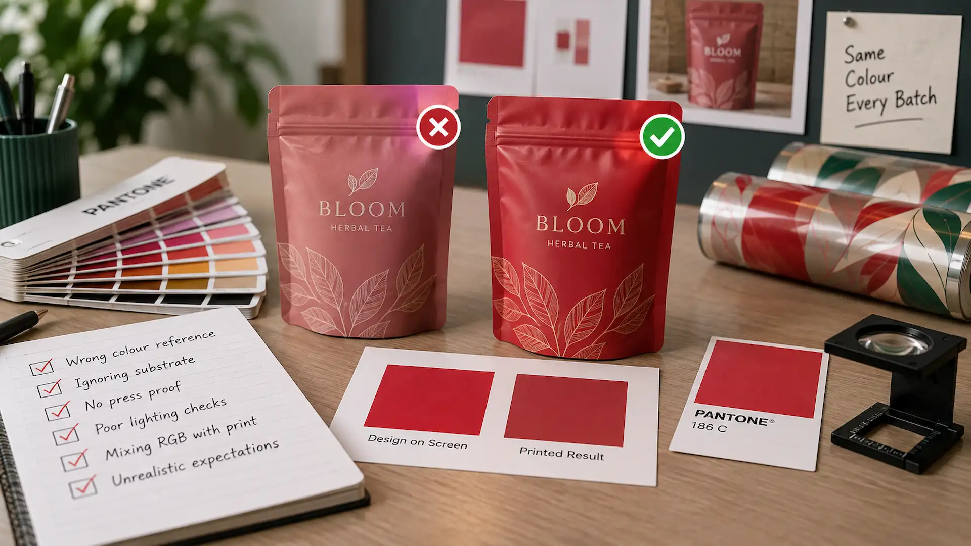
Common Pantone and Spot Colour Mistakes to Avoid
Most colour complaints trace back to a handful of repeat issues. Each one below is cheap to catch before production and expensive to catch after.
1- Choosing Packaging Colours Only From a Computer Screen
Screens emit light and pouches reflect it, so a backlit screen always looks brighter than the print. Choose from a physical reference and use the screen for layout.
2- Expecting Every Pantone Colour to Convert Perfectly to CMYK
Some Pantone colours sit outside what four process inks can reach, so converting gives the closest match rather than a duplicate. Pantone publishes Color Bridge so you can compare a spot colour against its nearest CMYK build.
3- Ignoring the Pouch Material and White Ink
The film under your artwork and the white layer behind it shape the result more than most people expect. Decide both when you decide the colour.
4- Approving Colour Without Considering the Final Finish
Signing off on gloss and producing on matte is common and avoidable. Approve of the finish you are actually buying.
5- Using RGB Artwork for Print Production
RGB files are built for screens, so sending them to a press means someone converts them without your input. Build in CMYK and supply vector artwork.
6- Changing Colour Specifications Between Reorders
Small file edits cause slow, invisible drift. A swatch gets renamed, a colour gets rebuilt differently, and nobody notices until two batches sit side by side.
When Should You Use Pantone Spot Colours for Flexible Packaging?
Spot inks are not automatically the better option. They are the right option in specific situations, and these are the main ones.
When Exact Brand Colour Is a Priority
If a colour is doing brand recognition work, protect it. Logos, signature colours and large solid areas are the strongest candidates.
When a Brand Colour Is Difficult to Reproduce With CMYK
Very bright or unusually specific colours often sit at the edge of process reach, and a dedicated ink solves that.
When You Need Consistency Across Products and Repeat Orders
Long-running product families benefit most. If you print the same design for years, a fixed spot reference protects it from gradual drift.
When CMYK May Be the Better Choice
- Artwork is photo-heavy or full of gradients
- The design carries many colours at once
- You are ordering shorter runs or several SKUs together
- You need speed more than absolute colour precision
- The design does not depend on one exact standalone colour
There is no prize for using spot colours where they are not needed.
Pantone Colour Checklist Before Printing Your Pouches
- Pantone number confirmed from a current physical reference
- Critical vs non-critical colours identified and stated in writing
- Pouch material and film structure selected
- White ink decided — flood, selective or none
- Printing method agreed — digital or rotogravure
- Artwork built in CMYK, no stray RGB elements
- Spot colours named and separated correctly, duplicates merged
- Finish chosen — matte, gloss or specialty
- Proof reviewed for the right thing, under consistent lighting
- Approved sample stored for future reorders
Ten checks. Most colour disputes trace back to one being skipped.
Conclusion
Pantone gives everyone a common colour target, and that alone solves a real problem. But on a pouch, the target is only part of the story. Film choice, white ink, print process, lamination and finish all shape what a customer finally sees on shelf, and every one of those decisions happens before the press runs.
The brands with the most consistent packaging are not the ones with the strictest Pantone rules. They are the ones who decide colour, material and printing method together, review a real proof, and keep an approved sample to reorder against.
Ready to Get Your Brand Colour Right on the First Run?
Send us your artwork, Pantone references, pouch structure and quantity. Our team will advise on the printing method and white ink setup that suits your colour requirements.
FAQs
1- What are spot colours in flexible packaging?
A spot colour is a pre-mixed ink applied as a single solid colour rather than built from CMYK inks on press. In flexible packaging they are specified by Pantone number and used for logos, brand colours and large flat areas where consistency matters most.
2- What is the difference between Pantone and CMYK printing?
Pantone spot colours are individual inks mixed to a set formula and printed from their own unit. CMYK builds colour by combining cyan, magenta, yellow and black in tiny dots. CMYK handles photographs efficiently; Pantone suits brand-critical solid colours that must stay consistent.
3- Can Pantone spot colours be printed on flexible pouches?
Yes. Rotogravure uses a separate engraved cylinder for each colour, so dedicated Pantone spot inks can run alongside CMYK. Flexible Pouches supports presses carrying up to ten cylinders, allowing several spot colours in one design.
4- Can digital printing match a Pantone colour?
Digital printing reproduces Pantone references through the process colours available rather than a dedicated spot ink. The Flexible Pouches digital workflow prints in CMYK plus white, aiming at your target through the process build. Results are strong, but the mechanism differs from a true spot ink, so confirm before artwork approval.
5- Why does the same Pantone colour look different on different pouch materials?
Printing inks are translucent, so whatever sits behind them affects what you see. A colour printed on white film, clear film, metallized film or kraft-look laminate reads differently each time. White ink, lamination and finish add further influence, so review colour on the real construction.
6- Are Pantone spot colours more expensive than CMYK printing?
Spot colours can add cost, because each may need its own print station and, on rotogravure, its own engraved cylinder. On large runs with simple artwork that cost spreads well. On short runs or photo-heavy designs, process printing is usually more economical.