

























A thin white line through a logo. That is usually the first anyone hears about trapping, and by then ten thousand pouches are already printed. The line is not a design mistake. It is misregistration, which means the colors did not land in exactly the same place as the material ran through the press. Trapping is the prepress step that makes that shift invisible, and it is one of the few parts of the process that costs nothing to get right and a full reprint to get wrong.
What follows covers what trapping does, why flexible packaging suffers from it more than any other kind of print, and where jobs go wrong. Most of this happens in files you will never open, handled by people you will never meet. That is exactly why it is worth understanding what they are protecting you from.
What Is Trapping in Printing?
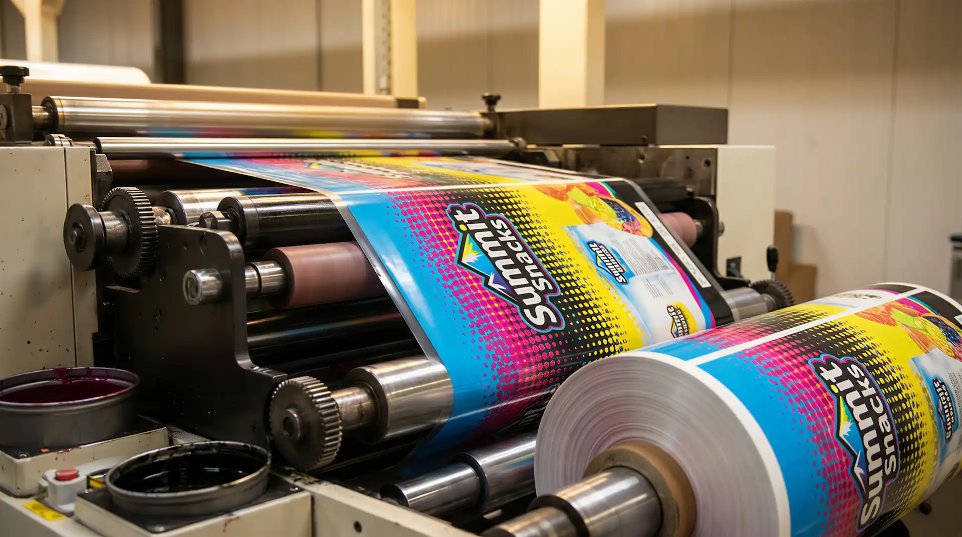
Every color on a press prints separately. Cyan goes down, then magenta, then yellow, then black, each from its own unit. The film travels between them under tension, and it moves. Not much, but enough.
Trapping compensates in advance by overlapping one color slightly into the edge of the one beside it. In practice that means:
- The overlap is tiny, usually 0.1mm to 0.3mm, invisible in the finished print
- It works as insurance: if the material shifts, the overlap covers what would have been a gap
- It is built into the artwork during prepress, before anything reaches a press
- Without it, perfect artwork still produces white gaps, halos or ragged edges on the finished job
A useful way to picture it: the colors are cut slightly oversized so they still meet after everything moves.
Why Is Trapping Important in Packaging?
Print quality is the only quality signal a shopper has before buying. They cannot taste the coffee or try the supplement. All they can assess is whether the pack looks like it came from a business that pays attention.
Here is why trapping matters so much in packaging specifically:
- Branding: a hairline gap makes a logo look unfinished, and people register that without ever identifying what bothered them
- Shelf appeal: on a crowded shelf, clean printing wins a comparison the shopper is making unconsciously
- Product perception: nobody separates the quality of the packaging from the quality of what is inside it
Ink traps matter more here than in almost any other print category, because film stretches, shifts and runs under tension in ways paper never does.
If you are producing custom printed stand-up pouches or any flexible format, this is the step standing between good artwork and an expensive lesson.
How Trapping Works
One color expands into the edge of the next. That overlap is called the trap width, and it sits between 0.1mm and 0.3mm for most work.
Here is the simplest way to picture it:
- Color A (say yellow) and Color B (say blue) sit next to each other
- Without trapping, any shift opens a white gap between them
- With trapping, yellow overlaps into the blue, or the reverse. The press shifts, the overlap absorbs it, nothing shows
Which color expands is not a coin toss. There is a rule behind it, and the next section is where that rule lives.
Types of Trapping in Printing
Three methods handle nearly everything, and all three are decided by relative darkness rather than by preference.
- Spread (Light into Dark)
The lighter color grows into the darker one. Dark dominates visually, so the expanded light color vanishes into it without anyone noticing. This covers most situations.
- Choke (Dark into Light)
The lighter color shrinks back instead, letting the darker color hold its shape. Used when a dark object sits on a light background, because expanding the dark one would visibly fatten it.
- Neutral Density Trapping
Neutral density measures how dark an ink reads, and every ink has its own value. Trapping software compares the two neutral densities and spreads the lighter one. When both colors read almost identically, neither dominates, so the trap runs along the boundary instead of favoring either side.
Specialty inks break this logic. Metallic and opaque spot colors do not behave like process inks, and a lot of automated trapping simply gives up on them and leaves the intersection untrapped. If your design carries a metallic, ask your printer how it is being handled rather than assuming the software sorted it.
What Causes Misregistration in Printing?
Trapping exists because presses are mechanical and materials are not perfectly stable. In a well-run job the error is genuinely small, often no more than half a halftone dot, but half a dot at a color boundary is still a visible white line.
- Paper or film movement: the material shifts as it travels between print units
- Machine vibration: high-speed presses vibrate, and tiny positional shifts follow
- Ink behavior: different inks dry and absorb at different rates
- Substrate differences: films, foils and paper all respond differently to heat, pressure and web tension
Deadlines contribute too, though nobody writes that on a job ticket. A press run faster than its optimum produces more register error, and the pressure to hit a ship date is where that decision usually comes from.
Trapping in Different Printing Methods
The amount of trapping a job needs depends almost entirely on how it is being printed.
Offset Printing
Metal plates hold the register tightly, so offset needs relatively narrow traps. It still needs them, particularly on long runs where small movements accumulate across thousands of impressions.
Flexographic Printing
Flexo dominates flexible packaging, and it needs the widest traps of any method. The plates are photopolymer and they wrap around a cylinder, which distorts the image slightly as it bends. Add fast press speeds and a substrate that stretches under tension, and the register tolerance opens up considerably. Trap settings that work on an offset job will not survive a flexo run on film.
Digital Printing
Digital lays every color in a single pass. No separate plates, nothing to align, so misregistration is minimal and most jobs need little or no trapping at all. For brands running detailed artwork or fine type, that alone can justify the format.
Trapping for Flexible Packaging
Film does things paper does not. It stretches under tension, shifts under heat, and keeps moving after the ink is down.
Here is what trapping has to account for on flexible substrates:
- Material stretch: film moves under web tension during printing and again during filling and sealing
- Ink adhesion: inks sit on the surface of film rather than soaking in, which changes how edges behave
- Substrate type: laminated structures like those in retort pouches need trap settings that differ from standard film
Then there is the one unique to film, and it catches people out constantly. The substrate is clear, so almost every flexible pack carries a white ink layer printed underneath the artwork to give the colors something to sit on. That white layer needs trapping in its own right. Get the relationship between it and the colors above wrong and you get a pale halo outlining every element, which looks worse than the gap you were trying to prevent.
Rich blacks cause a related problem. A deep black is usually built from black plus a percentage of other inks, and when white type is reversed out of it, any shift lets those underlying colors peek out around the letters. The fix is holding the supporting colors back from the edge so only the black defines the shape.
Wrong trap values produce color gaps on a press running perfectly, which is why this conversation belongs with your printer before production. Understanding your material options is part of that discussion, since the substrate drives the settings.
Common Trapping Mistakes to Avoid
Four mistakes account for most trapping failures, and experienced designers make all of them.
- Too much trapping: an overlap that is too wide shows as a colored halo, which reads just as badly as a white gap
- Too little trapping: not enough overlap and the gaps appear anyway, especially on film
- Wrong color priority: expanding the wrong color creates muddy edges where the two mix badly
- Ignoring the substrate: values that are correct for paper can be completely wrong for film or foil
There is a fifth worth knowing about. Trap elements have a fixed width, and thin strokes in type can be narrower than the trap itself. Good prepress software limits the trap to half the available space so it never overshoots the far edge of a letterform. Software that does not will thicken your type and nobody will be able to say quite why it looks wrong.
Best Practices for Perfect Trapping
None of this is complicated. It just has to happen before the press starts.
- Use prepress software: Illustrator, Esko and dedicated RIP software all apply trapping automatically
- Test print before production: run a proof before committing to a full order, every time
- Work with professional printers: an experienced printer catches trapping problems in prepress, which is the only cheap place to catch them
- Use the correct trap width: 0.1mm to 0.3mm is standard, but flexo on coarse substrates runs wider. Ask your printer for their numbers rather than guessing
- Review your trapping files carefully: check every element, including logos, text and illustrations, before production
One more, which is a design decision rather than a prepress one. If two adjacent colors share a percentage of the same ink, the boundary between them stops being a trapping risk at all. Designers have used that trick for decades, and it is worth knowing before you commit to a palette of pure, unrelated colors.
Trapping vs Overprinting Explained: When and Why to Use Each
These two get confused constantly, and choosing the wrong one produces color problems that survive all the way to the finished pack.
| Feature | Trapping | Overprinting |
| What it does | Overlaps two adjacent colors slightly to prevent visible gaps caused by misregistration. | Prints one color directly on top of another without knocking out the color beneath. |
| When to use it | When two colors sit next to each other and might shift slightly during printing. | When one color should overprint rather than remove the color below, often for text, dark inks or special effects. |
| Result | No visible gap between colors; edges align smoothly. | Colors mix where they overlap, producing a blended or darker tone. |
Trapping hides a mechanical problem. Overprinting creates an intentional effect. Opposite purposes, similar-sounding names, and that is the whole reason they get mixed up.
When Do You NOT Need Trapping?
Trapping is not free of consequences, and applying it where it is unnecessary creates its own visible problems.
Digital printing: all colors land in a single pass, so the misregistration risk that trapping solves largely disappears.
High-precision presses: some modern flexo and offset presses hold register tightly enough that trapping needs drop to a minimum.
Black text on a white background: small black text on plain white has no second color to misalign against, so there is nothing to trap.
Printer’s marks are worth mentioning here too. Register marks, trim marks and fold marks should never be trapped, since their whole purpose is precise positioning. Good software recognizes and excludes them automatically.
Real-World Example
A yellow sunburst on a red background, printing on a stand-up pouch. Untrapped, a 0.2mm shift on press opens a white line running straight through the middle of the logo, exactly where the eye goes first.
With the trap in place, the yellow expands slightly into the red. The press shifts by the same 0.2mm. The overlap absorbs it and the logo looks the way the designer drew it. That is the entire difference. A step nobody ever sees, protecting the one thing everybody does.
Conclusion
Trapping is a small technique with an outsized effect on how packaging looks. It prevents white gaps, protects the brand, and keeps colors meeting cleanly even as materials move during printing, which on flexible substrates they always do.
For a detailed guide on trapping techniques and industry standards, see this Adobe guide on trapping.
Stop Letting Bad Trapping Ruin Your Packaging
Your brand deserves packaging that looks exactly as designed: sharp colors, clean edges, zero white gaps. Our prepress team reviews every file before it reaches the press, so what you approve is what you get.
FAQs
Q1: What is trapping in printing?
A prepress technique where two adjacent colors are overlapped slightly, so any shift on press does not leave a white gap between them.
Q2: Why is trapping important in packaging?
Films and pouches stretch and shift during printing far more than paper does. Trapping keeps the colors meeting cleanly even when that movement happens.
Q3: What is the difference between trapping and overprinting?
Trapping overlaps two colors to hide a mechanical problem. Overprinting layers one color over another on purpose, so they mix. Different jobs entirely.
Q4: What are trapping files?
The print-ready artwork with the overlap settings built in. They are prepared in prepress, before the job goes anywhere near a press.
Q5: How much trapping is needed?
Usually 0.1mm to 0.3mm, though it depends on the method and the substrate. Flexo on film needs noticeably more than offset on paper.
Q6: Does digital printing require trapping?
Little to none. Every color goes down in a single pass, so there are no separate plates to fall out of alignment.
Q7: What is an ink trap?
The overlapping zone where two colors meet. It is the area that catches any misalignment before it becomes a white line on your pack.