
























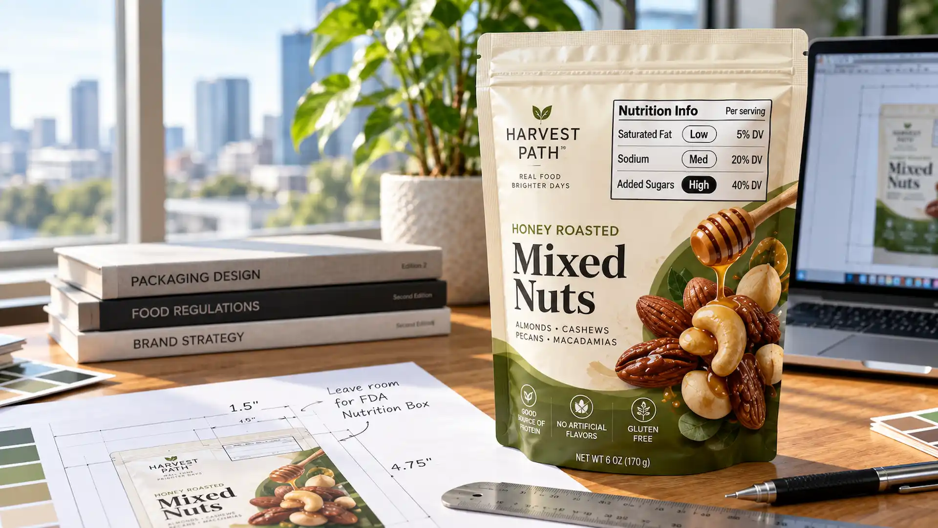
The FDA has proposed a front-of-package labeling rule that would add a small “Nutrition Info” box to the front of most packaged foods. That box would show a food’s saturated fat, sodium, and added sugars before a shopper even picks it up. It would be one of the bigger shifts in U.S. food labeling regulations in years. If your food ships in flexible pouches, it’s worth getting ahead of now, because a pouch front has very little room to spare.
Think about everything that already lives on the front of your pouch: the logo, product name, flavor, a photo, a claim or two, and the net weight near the bottom. Adding one more required element to that mix isn’t simple. The good news is that the rule isn’t final, so nobody has to reprint anything today. But if you’re choosing a custom flexible pouch for a new product, smart food packaging and labeling means building in room to adapt later. This guide walks you through how to do that.
What Is the FDA’s Proposed Front-of-Pack Nutrition Box?
The Nutrition Info box is FDA’s idea for a new food label on the front of the pack. It gives shoppers a quick read on three nutrients, so they don’t have to turn the package around to find the Nutrition Facts panel.
What Information Would the Nutrition Info Box Show?
Under the proposed rule, the box would carry the title “Nutrition Info” and cover three nutrients per serving:
- Saturated fat
- Sodium
- Added sugars
Each would show its % Daily Value and a simple rating based on how much of your daily limit one serving uses:
| % Daily Value per serving | Rating shown in the box |
| 5% or less | Low |
| 6% to 19% | Med |
| 20% or more | High |
Let’s put real numbers on it. Say a pouch of chili-lime cashews has 480 mg of sodium, 2 g of saturated fat, and 1 g of added sugars per serving. That works out to about 21% DV sodium (High), 10% saturated fat (Med), and 2% added sugars (Low).
The box is meant to work alongside the Nutrition Facts panel, not replace it. Calories wouldn’t appear inside the box, although brands could still show calories elsewhere on the front if they want to.
Why Is FDA Proposing Front-of-Package Labeling?
The short answer is speed. Shoppers decide in seconds, and the Nutrition Facts panel usually sits on the back. In FDA’s testing with nearly 10,000 U.S. adults, this black-and-white design helped people spot healthier options best. Unlike a warning-style nutrition symbol, it would appear on every covered product, good numbers or bad.
Is the FDA Front-of-Pack Nutrition Box Required Yet?
No. As of late September 2026, the Nutrition Info box is still a proposal. Here’s where it sits on the path from idea to deadline:
| Stage | Where the FOP rule stands |
| Proposed rule | Published January 16, 2025. Comments closed July 15, 2025 |
| Final rule | Not published yet. FDA had aimed for May 2026 |
| Effective date | Proposed as 60 days after the final rule is published |
| Compliance date | Proposed as 3 years later for firms with $10 million+ in food sales, 4 years for smaller ones |
Recent labeling regulations news shows the details are still moving. In March 2026, FDA Commissioner Martin Makary said the agency didn’t like the plan it inherited, and FDA’s top food official told Bloomberg Law that bigger changes could mean re-proposing the rule. Still, it remains on FDA’s 2026 priority list, so watch FDA food packaging news. Plan for flexibility now, but don’t lock an unfinished requirement into your packaging.
Important Note: Don’t print the proposed box on live packaging just to look ready. The format or placement could change, and a box that doesn’t match the final rule could confuse shoppers and force a reprint anyway.
Which Food Products Could Be Affected?
Before you change any artwork, it helps to know if your product would even need the box. The proposal is broad, but it doesn’t cover everything.
Packaged Foods That Could Fall Under the Proposed Rule
In plain terms, it would cover most packaged foods that already carry a Nutrition Facts label and are meant for people aged 4 and up. That takes in most pouch foods, like chips, nuts, granola, jerky, and drink mixes. Foods sold from bulk bins would need the box shown where shoppers buy them.
Dietary supplements are a different story. They use a Supplement Facts label, so they sit outside this proposal.
Products and Packages That May Be Exempt
The proposal lists several exemptions. These are the ones pouch brands ask about most:
| Product or package | What the proposal says |
| Less than 12 sq in of total labeling surface | Exempt, unless the label shows nutrition information such as a claim |
| 40 sq in or less of labeling surface | Can use a smaller “intermediate” box that shows only Low, Med, or High |
| Raw fruits and vegetables | Exempt |
| Low-volume products from small firms | Exempt if under 100 full-time employees and under 100,000 units a year |
| Gift packs with an assortment of foods | Exempt |
| Single units inside a multi-pack | Exempt when the outer retail package carries the box |
| Foods made for children under 4 | Not covered |
Every exemption depends on the final wording, so use this table for planning only.
Why Small Flexible Pouches Need Extra Planning
Small formats get tight fast. The box may be simpler on small packs, but the front panel shrinks faster. Take extra care with:
- Snack pouches: Photos and flavor names leave little free space.
- Single-serve packages: Many one-portion packs could fall into the 40 sq in group.
- Small stand-up pouches: A narrow front can’t fit much across the top third.
- Sachets and other compact formats: Stick packs and sachets may drop below 12 sq in, but the carton or caddy holding them could still need the box.
Important Note: The 12 and 40 square inch limits are based on the total surface area available for labeling, not just the front panel. Measure from your real dieline, and have a label reviewer confirm before you assume a pouch is exempt.
Where Would the Nutrition Info Box Go on a Food Pouch?
The placement rule sounds simple on paper. On a real pouch, with a zipper up top and seals down both sides, it gets trickier, so let’s start with the basics.
First, Understand Your Principal Display Panel
The principal display panel (PDP) is the part of the package a shopper is most likely to see when buying. On most stand-up pouches, that’s the front face. FDA measures a rectangular PDP by multiplying height by width, and that area also sets the minimum type size for your net weight.
Find your PDP first. Until you know which face counts and how big it is, you can’t plan where anything else should go.
Proposed Placement of the Nutrition Info Box
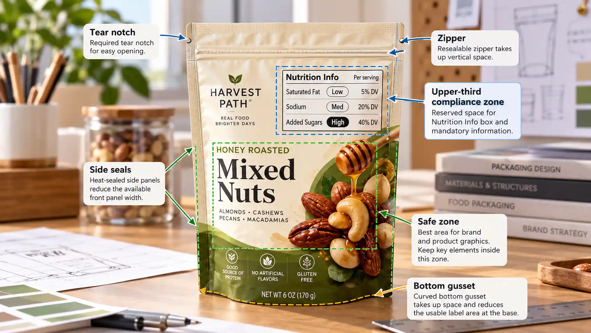
The current proposal places the box in the upper third of the PDP. FDA didn’t pin it to an exact corner or a set distance from the edge. The draft specs also call for:
- Text of at least 8 point, with the “Nutrition Info” title larger than the rest
- Text and lines in black or one single color
- A white or other neutral background
- Nothing else placed inside the box
These specs could still change, so plan the zone rather than the exact spot.
Why Pouch Construction Changes the Available Space
A folding carton gives you a flat, stiff top third to work with. A pouch doesn’t, which is why package labeling on pouches needs its own plan. Several parts of the build eat into the space where the box would sit:
| Pouch feature | How it affects the top third |
| Zippers | Run across the top, and nearby film can wrinkle |
| Tear notches | Cut into the side seal, so keep text clear of them |
| Heat seals and side seals | Crimped areas where small text won’t read well |
| Bottom gussets | Fold under and shorten the visible front |
| Rounded edges | Trim away corner space |
| Hang holes | Punch through the top center |
| Usable print area | Shrinks once seals and trim are removed |
| Artwork safe zones | Keep key content away from trim and seal lines |
A filled pouch also bulges, so small text near the edges can curve away from the eye. On clear or metallized film, and often on kraft, you’ll likely need a white ink layer behind the box to give it the neutral background the proposal asks for. Good labeling for food on a pouch has to account for all of this.
How Much Space Should You Leave for the Front-of-Pack Box?
There’s no single measurement that works for every pouch. The right amount of room depends on these factors:
- Package size, because a 2 oz pouch and a 5 lb bag need very different plans
- PDP dimensions, since width matters just as much as height
- Your nutrition profile, which decides which claims can safely sit near the box
- The proposed format, as a full box needs more room than the intermediate one
- Existing mandatory information, like your product name and net weight
- How many branding elements and claims you’re already carrying
- Pouch construction, because zippers, seals, and gussets all shrink the printable area
Start With Your Smallest Pouch
If one product comes in 3 oz, 8 oz, and 16 oz pouches, design the 3 oz version first. Minimum type sizes don’t shrink with the bag, so the smallest pouch is where a layout usually breaks. Check the width, height, and bottom gusset of each size too, because a narrow pouch leaves far less room across the top than a wide one.
Build a Flexible Compliance Zone Into the Artwork
A flexible compliance zone is a part of the upper third you keep easy to change. It doesn’t have to be an ugly empty rectangle. It can hold a secondary claim or small illustration that could move later without touching your logo.
Mark that zone as its own layer on your pouch dieline, so every designer knows it’s there. If the rule is finalized, you only swap what’s inside that zone.
Test the Design at Actual Print Size
It happens more often than you’d think: a layout that looks roomy on a 27-inch monitor feels cramped on a 5-inch-wide pouch. Print a full-size proof, wrap it around a filled sample, and view it from arm’s length. If 8-point text is hard to read there, it will be hard on the shelf too.
What May Need to Move to Make Room?
Next comes the question of where that room comes from. The answer is almost never “cut your branding.” Prioritize, reposition, and simplify before you shrink anything.
| Front-panel element | Can it move? | A smarter option |
| Logo | Keep it strong | Protect its size and move other items first |
| Product name | Must stay on the PDP | Keep it bold and clear |
| Flavor or variety | Yes | Tuck it under the logo or into a color band |
| Product photography | Yes | Crop tighter or move it lower |
| Illustrations | Yes | Simplify them or wrap them onto the side |
| Marketing claims | Yes | Keep your best one and move the rest to the back |
| Nutrition callouts | Yes, with care | A “low sodium” claim would need a Low sodium rating |
| Certifications | Often | Group small marks in one row |
| Promotional badges | Almost always | Use a sticker or a limited run instead |
| Net quantity statement | No | It stays in the bottom 30% of the PDP |
Moving three or four secondary items usually frees more space than shrinking the logo ever could.
How to Make Room Without Ruining Your Pouch Design
Making space shouldn’t turn your pouch into a crowded label. These five habits keep the design clean now and easy to update later.
1- Protect Your Brand Hierarchy
Shoppers should still spot your product from across the aisle. Set a reading order, usually logo, product name, then flavor, and protect the first two no matter what moves.
2- Use White Space Intentionally
A bit of open space in the top third isn’t wasted. It makes everything easier to read, and it gives a new box somewhere to land later.
3- Simplify Competing Front-Panel Claims
Five badges, two starbursts, and a banner might each feel important. Together, they make the front hard to read and harder to change. Keep the one or two claims that really sell your product.
4- Keep Required Information Readable
Don’t fix a space problem by shrinking type or setting pale text over a busy photo. FDA already requires most label text to be at least 1/16 inch tall, and the proposed box would need 8-point type or larger. If you have to squint at the proof, your shoppers will too.
5- Design a System That Works Across Every SKU
Picture a company that sells:
- 5 flavors
- 3 pouch sizes
- 2 product lines
That’s 30 separate pieces of artwork. If each one has its own layout, one rule change turns into 30 redesigns. Build a repeatable system instead: one template per pouch size, the same zones in the same places, and only the flavor details changing. Then a single update can roll out across the whole range.
Don’t Forget the Rest of Your FDA Food Label
The Nutrition Info box would be added on top of the FDA labeling requirements for food you already follow. Here’s a quick look at what already takes up room on a pouch. For the full rules, FDA’s Food Labeling Guide is the best place to start.
1- Statement of Identity
This is the common name of your food, such as “Roasted Almonds” or “Chocolate Protein Granola.” It belongs to the PDP in bold, easy-to-read type. A clever brand name can sit above it, but it can’t replace it.
2- Net Quantity of Contents
Your net weight goes in the bottom 30% of the PDP, shown in both U.S. and metric units. Its minimum type size grows with the size of the panel, so a bigger pouch needs bigger numbers.
3- Nutrition Facts Panel
The full Nutrition Facts panel sits on the information panel, which on most pouches ends up on the back. Every number in a future front box would have to match this panel exactly.
4- Ingredient and Allergen Information
Your ingredient list and allergen statement also go on the information panel. The U.S. has nine major food allergens, sesame included, and each one must be clearly declared.
5- Manufacturer, Packer, or Distributor Information
List the name and address of the business responsible for the food. If you didn’t make it yourself, add a phrase like “Distributed by” or “Manufactured for.”
A future front-of-pack element has to work with all of these, not squeeze into whatever space is left.
Front-of-Pack Nutrition Labels vs. Warning Labels on Food
These terms get mixed up a lot, but they work in different ways. FDA’s proposed box is meant to inform, so it isn’t a warning label, even when it says “High.”
| Label type | How it works | Real example |
| Nutrition information | Numbers only, usually on the back or side | The U.S. Nutrition Facts panel |
| Front-of-package labeling | Rates key nutrients on every covered product | FDA’s proposed Nutrition Info box (Low, Med, High) |
| Nutrition symbol | Appears only when a food is high in certain nutrients | Canada’s magnifying glass “High in” symbol |
| Warning-style labels | Short, blunt alerts about nutrients or ingredients | Chile’s black “high in” labels and Texas SB 25’s ingredient warning |
Canada is worth a closer look if you sell across the border. Under Canadian food labelling regulations, most prepackaged foods high in saturated fat, sugars, or sodium must now show a bilingual symbol on the front. That rule has been in force since January 1, 2026, so one pouch sold in both countries may need room for two different front-panel elements.
In the U.S., warning labels on food are still mostly a state-level fight. Texas passed SB 25, which would require a warning on foods containing any of 44 listed ingredients, but a federal court blocked enforcement in February 2026 while the case continued. Meanwhile, UC Davis researchers have argued that simple “high in” labels help shoppers more than Low, Med, and High ratings, which is one more reason the final U.S. design could still change.
Common Mistakes When Preparing Pouch Artwork for Future Label Changes
Most expensive redesigns come from a handful of slips that are easy to avoid. Watch out for these:
- Treating a proposed rule as if it were already final. Proposals often change before they become law.
- Printing speculative requirements too early. A guessed-at box may still need a reprint.
- Filling every inch of the principal display panel. A packed front leaves nowhere to go.
- Testing only the largest pouch size. Small pouches expose layout problems first.
- Shrinking text and important information to create space. That just creates a new compliance problem.
- Forgetting zippers, seals, gussets, and safe zones. They take up more room than most designers expect.
- Redesigning one SKU without considering the full product line. One-off fixes multiply fast.
- Forgetting existing FDA labeling requirements. The box adds to them, it doesn’t replace them.
- Approving production artwork without regulatory review. A label reviewer can catch mistakes before thousands of pouches are printed.
Front-of-Pack Pouch Planning Checklist
Run through this list before any new food pouch goes into production. It’s short enough to pin next to your screen.
- Confirm the principal display panel
- Review the FDA labeling requirements that apply to your product
- Check the current status of the front-of-pack proposal
- Check food packaging and labelling rules for every country you sell in
- Identify your smallest package size
- Map all existing mandatory information
- Reserve adaptable space in the upper third
- Check your logo and product-name hierarchy
- Cut unnecessary front-panel clutter
- Account for seals, the zipper, and the tear notch
- Review the dieline and print-safe areas
- Test the artwork at actual package size
- Check every size and SKU
- Keep editable master artwork files
- Complete a proper compliance review before printing
Why Planning Now Can Save a Costly Pouch Redesign Later
Once a rule is final, updating your packaging isn’t optional. Planning decides how painful it is. Flexible artwork helps you avoid:
- Emergency artwork changes and paying for the same redesign twice
- SKU-by-SKU corrections and packaging delays
- Branding that drifts from one flavor to the next
- Obsolete inventory and disruption on your packing line
The print method matters too. Changing artwork on rotogravure cylinders means making new ones, so keep the future box area on one black layer. Digital printing needs no plates at all. You don’t have to predict the final rule, just make packaging that’s easy to adapt.
Conclusion
The FDA’s proposed front-of-package Nutrition Info box could change how valuable front-panel space is used on many packaged foods, but it is still a proposal. Food brands do not need to guess the final rule or rush an unfinished requirement onto their packaging. What they can do today is make smarter decisions about space, hierarchy, pouch size, and artwork flexibility.
Start with your smallest pouch, understand the principal display panel, keep unnecessary clutter under control, and build artwork that can move when it needs to. Good packaging should work for the product you sell today without making tomorrow’s update unnecessarily difficult.
Build a Food Pouch That Has Room to Adapt
Planning a new product or refreshing an existing package? Flexible Pouches offers custom sizing, custom printing, different pouch configurations, material and finish options, and features such as zippers and tear notches. Building the right structure and artwork together can give your brand a strong shelf presence without treating usable packaging space as an afterthought.
Request a Custom Packaging Quote from Flexible Pouches
FAQs
1- Is the FDA front-of-pack Nutrition Info box mandatory yet?
No. FDA proposed it in January 2025, and it still isn’t final as of late September 2026. If it’s finalized as proposed, larger businesses would get three years after the effective date to comply, and smaller ones would get four.
2- What information would appear in the FDA Nutrition Info box?
The box would show saturated fat, sodium, and added sugars per serving. Each nutrient would have its % Daily Value and a rating of Low, Med, or High. Calories wouldn’t go inside the box.
3- Where would front-of-package nutrition information appear on a pouch?
The proposal places it in the upper third of the principal display panel, usually the pouch’s front face. The FDA hasn’t named an exact spot within that area.
4- What is the principal display panel on food packaging?
It’s the part of the package shoppers usually see first, which is normally the front. Your product name and net quantity must appear there, and the proposed box would too.
5- How much room should I leave for future front-of-pack labeling?
There’s no fixed measurement. Keep a flexible area in the upper third filled with secondary elements you can move later. Then test that layout on your smallest pouch at its actual print size.
6- Should I redesign my food pouch before the FDA rule is finalized?
You don’t need to reprint current stock. But if you’re designing or refreshing a pouch anyway, build in flexibility now, so a final rule means a small edit, not a full redesign.